


As of the writing of this article, the W3C Design Tokens Standard is still in development. Its goal is to establish a universal framework for using tokens that will be compatible with any tool or platform. This has the potential to be a game-changer and is worth keeping an eye on.
If you want to integrate design tokens into your design system but don’t quite know where to begin, you’re not alone. Adding design tokens to an existing system calls for good organization and consistent use. This already challenging task is not made any easier by the lack of standard naming conventions.
In this article, we’ll delve into how our team integrated design tokens into our design system, Ictinus. We’ll discuss the challenges we encountered, the solutions we came up with, and the impact design tokens had on our workflow. Finally, we’ll share insights gained from our experience.
What are design tokens?
A design token is a piece of data that encapsulates a single design decision.
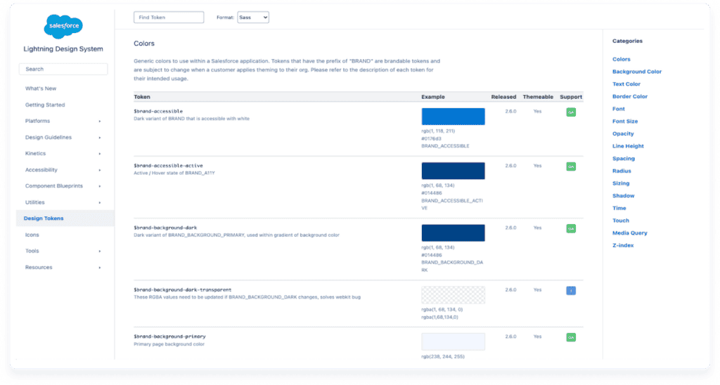
The term ‘design token’ was first coined by Jina Anne at Salesforce in 2014. They can represent a wide range of properties and link (‘alias’) to other tokens, making them scalable by nature.
Sound familiar? It’s similar to how programming variables work: you declare a specific value which is then propagated to many different instances. These values and relationships can be represented in JSON format.
What are the benefits of design tokens?
In our preliminary research, we analyzed the approach of other Design Systems (e.g. Polaris, Carbon, etc.) and read up on token literature and best practices. Our early findings were enough to convince our team: tokens were worth the time, cost and effort of integration. Our biggest challenges at the time were gaps in communication and insufficient change tracking. Tokens promised to help with these issues as well as do the following:
1. Resolve gaps in communication
Design decisions often got ‘lost in translation’ due to inadequate documentation and time pressure. Discrepancies between design and implementation were not just common but expected. This translated to much more time and effort spent in QA – and still, mistakes could slip through.
2. Fix issues with change tracking
This gap in communication had a ripple effect. Changes in design documentation were not always reflected in current implementation. That made it hard to confirm whether a specific section of documentation was updated or not. When should we implement QA?
As a result, we had to freeze our design system to a specific version (V4); a last resort solution that opened a whole new can of worms. Last but not least, our current workflow all but ensured that the team ran at different speeds.
The more we learned about tokens, the more they seemed like a winning bet. They would help us resolve some of our biggest issues, become more efficient and enrich our design language.
3. Improve efficiency
Before Figma (our tool of choice) introduced variables, there was no way to natively link styles. Design tokens would allow us to mass-update multiple styles by editing a single aliased token. This would simplify maintenance and reduce cognitive load, allowing the team to focus on the bigger picture instead.
4. Extensive customization support
Design tokens can represent a wide range of properties beyond the usual color, typography, and layer effect styles. Tokens also support the following:
- Spacing
- Sizing
- Border radius
- Border width
- Animation styles
The challenges of implementing design tokens
It was not all sunshine and rainbows though. As mentioned before, a standardized framework for creating and using design tokens doesn’t exist just yet. In this article, Brian Heston addresses the most common design token implementation concerns.
Of special note is the mention that there is no common standard for naming and applying tokens. This lack of consistency poses challenges when combining components from different libraries. It also makes it hard to outline and follow a common set of best practices.
What token tiers are, and how we used them (aka layers, groups or sets…)
Before diving into token creation, we first needed to lay down the basics. What would we call different token levels, for example? And how many levels would we need?
Tokens can be organized into different levels of abstraction. Common names for different levels include ‘levels’, ‘types’, ‘tiers’, ‘layers’, ‘groups’, and ‘sets’. These levels help organize tokens based on their purpose, scope, or usage. We ended up going with ‘tiers’, as it was both the most unique-sounding and descriptive.
Naming settled, we shifted our focus to tier structure. How many tiers should we have? What should each tier contain? How would it relate to other tiers?
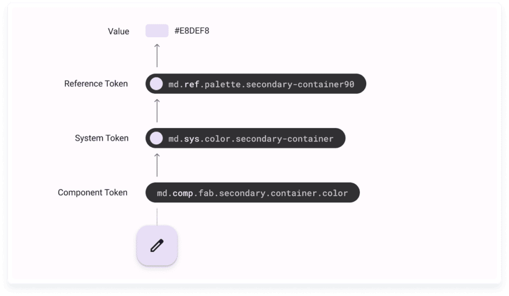
In the many faces of themeable design systems, Brad Frost suggests a three-tiered model that uses a vertical hierarchy.
Tier-1, the lowest tier, contains tokens that encapsulate raw visual design materials.
Tier-2 tokens are contextual, and link Tier-1 tokens to high-level usage.
Finally, Tier-3 tokens are specific to components and link to Tier-2 tokens.
How we named our tiers
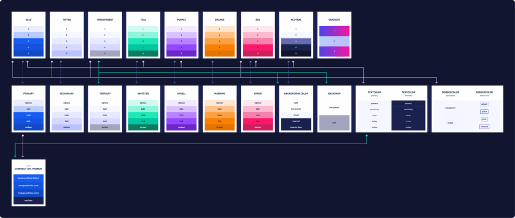
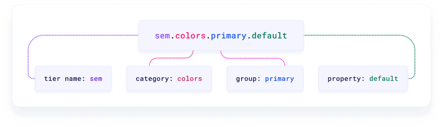
We settled on the name ‘global’ for Tier-1. It would contain every single tokenized value in our design system. ‘blue.3’, a token containing a single color value with no context, is an example of a ‘global’ tier.
Tier-2 would draw from ‘global’ to create contextual tokens. For example, ‘blue.3’, a global token, may link to the ‘sem.textColor.active’ semantic token to create a token describing text color for an ‘active’ state. We named this tier ‘semantic’ (‘sem’ for short).
You can think of Tier-2, the ‘semantic’ layer, as one of your theme layers. If you want to be able to switch to dark mode down the line, all you need is identical ‘semantic’ layers that point to different aliases.
Finally, Tier-3 became ‘component’ (abbreviated to ‘comp’). This final tier would link to Tier-2, drawing contextual tokens in component-specific combinations.
Token name conventions and semantic attributes
With the tiers in place, it was finally time to think about token name structure. What should we include in a design token name, and in what order? This well-known, oft-referenced talk by the Asana team on Schema 2021 served as a great starting point. The whole video is worth a watch, but of special interest is the hierarchical naming convention the Asana team uses to name design tokens.
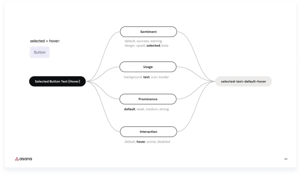
Inspired by Asana and mindful of HTML/CSS standards, we created our own set of naming rules as follows:
- A token name is composed of the following semantic attributes: tier.category.property.state
- Tier: Indicates the tier the token can be found in.
- The ‘Global’ tier is omitted from the token name for the sake of simplicity.
- Tokens found in the ‘semantic’ tier start with ‘sem.’
- Tokens found in the ‘component’ layer begin with ‘comp.’
- Category: Chooses a general token category (e.g. ‘spacing’). When used in a ‘comp’ token, ‘category’ displays the component name.
- Group: provides context on a given category (e.g. ‘background’ as a subcategory to ‘color’).
- Property: Contextual value of token. May also be state or variant. May also reference alternative visual variants for non-interactive components.
- Tier: Indicates the tier the token can be found in.
- Semantic attributes are separated by period (.)
- Token names that include more than one word are formatted in camelCase.
How we use Tokens Studio for Figma (our not so secret weapon)
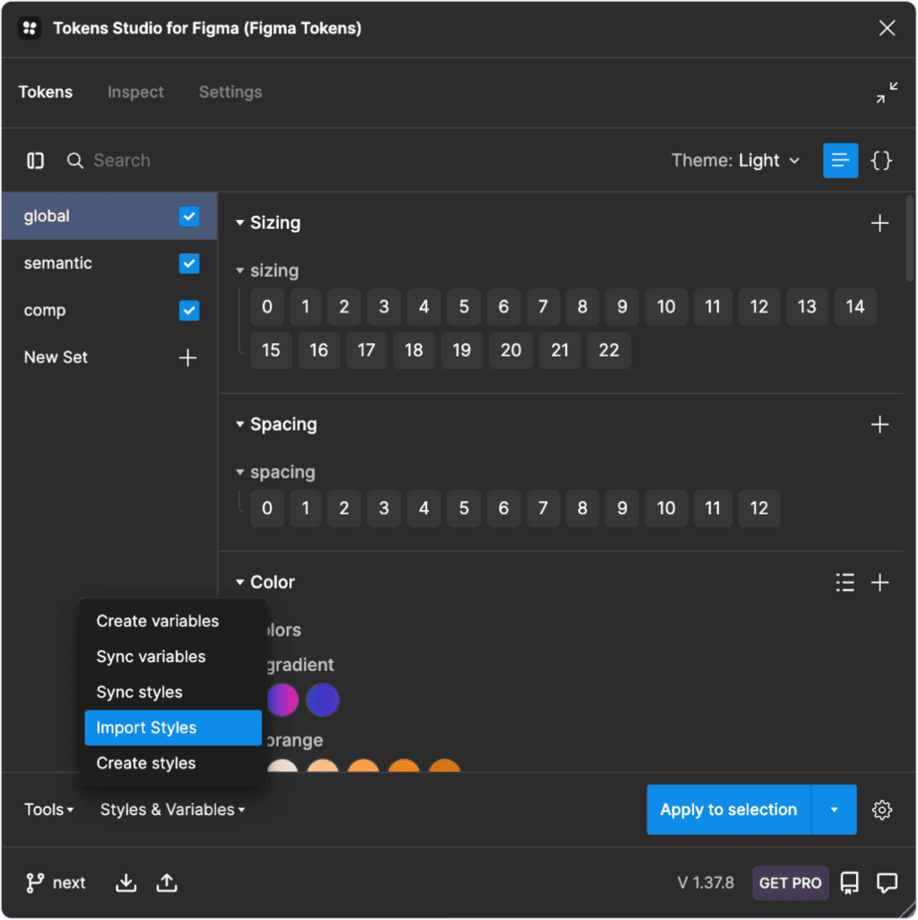
When we were implementing design tokens, Figma didn’t offer support for token creation as variables had not been released yet. Even now, variables do not support properties like border width (and, as of the writing of this article, cannot be exported in JSON without a plugin). This meant we would need to use a third-party tool. We chose Tokens Studio, a popular choice that we could easily integrate into our Figma workflow.
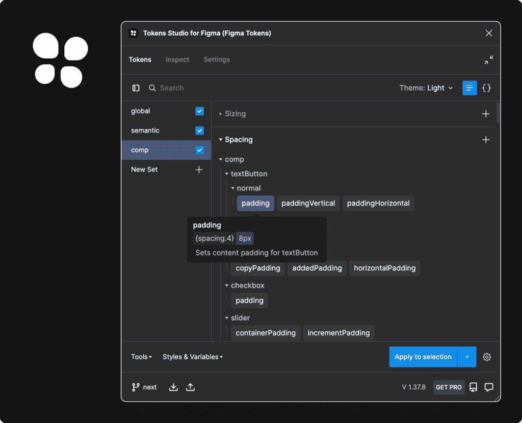
Tokens Studio for Figma represents tokens in JSON as a list of objects. You can create and edit tokens either via the user interface provided by the plugin or by directly editing the JSON code.
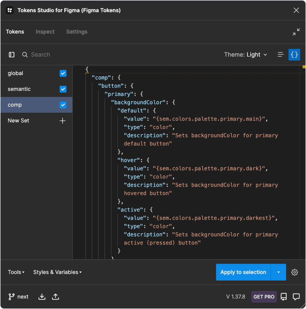
The ability to store the generated tokens as JSON in GitHub branches was a game-changer for our team. It allowed development to review design work as it was being done. Upon approval, typescript code would be auto-generated from said JSON. Finally, small issues were addressed and corrected in a fraction of the usual time. This was a big step towards bridging the aforementioned communication gap.
Importing global tier tokens
Tokens Studio allows you to import existing Figma styles and convert them into tokens; this saved us a lot of time. After we imported our preexisting color, typography, and layer effect styles into Tokens Studio, it was time for the good stuff. We created extra categories such as spacing, sizing, and border radius.
Semantic tier tokens
It was then time to begin work on the ‘semantic’ tier tokens. These are tokens with contextual meaning that link to context-less ‘global’ tokens. Semantic style examples include text color, typography styles, icon sizes, and interaction palettes. These styles are then combined in many different ways to make the final tier, ‘comp’.
Component design tier tokens
The component tier is the final layer (Tier-3). Each token created in this tier links to a ‘sem’ token. This allows for easy tracking of individual component tokens while still maintaining scalability.
The ‘category’ semantic attribute for ‘Component’ tier tokens is always the component name. This level of granularity allows for better control when working with large design systems.
Here’s an example of a ‘comp’ token:
comp.button.compact.iconSize
- ‘comp’: indicates ‘component’ token tier
- ‘button’: the component’s name
- ‘compact’: applies to compact button
- ‘iconSize’: sets icon size property
Results and Impact
The adoption and utilization of design tokens significantly enhanced our team’s workflow. Design tokens helped our team create a common language spoken by all and allowed for a unified mindset. This fostered a better understanding between designers and developers regarding each other’s constraints. It also led to significant delivery time and quality improvements.
Internal design-to-development average time was reduced by roughly 30%. This has a lot to do with the fact that token structure is similar for both designers and front-end developers. As a result, understanding them and applying them correctly became a more intuitive process for both disciplines. This was also a big help towards streamlining communication and reducing excess noise.
It reduced visual discrepancies between design and implementation. As a result, time normally spent on QA was instead used to better develop the components and pad the documentation. This affected onboarding of users and products to the design system, speeding up the process by approximately 65%. This allowed us to create better, more thorough documentation for component behavior and patterns. This led to a sharp decline in bug fix tickets (to the tune of approximately 55%).

The team’s upcoming steps involve introducing the highly-anticipated theming to ORFIUM products. Our previous framework made this a pipe dream, but with tokens, sky’s the limit!
Takeaways
Here are some practical tips to help your team adopt and use design tokens:
- Define a clear tier structure that your team can understand at a glance and use with ease. Each tier should have a distinct name, abbreviation, and purpose.
- Create naming conventions for your design tokens as a team. Make sure the naming conventions are easy to remember and use.
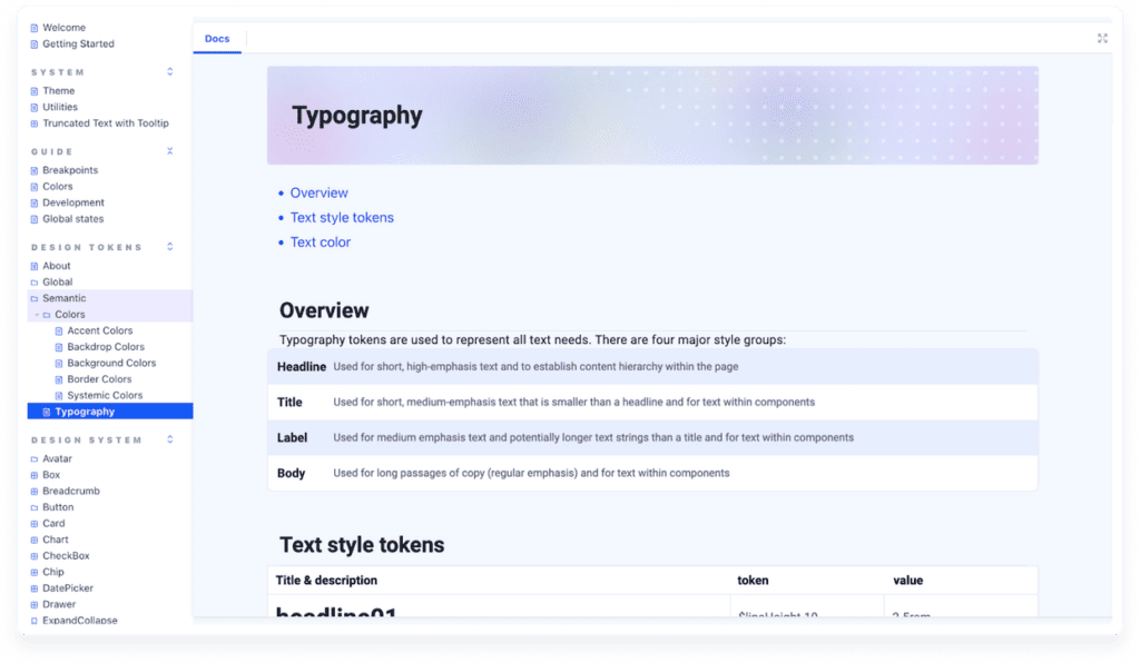
- Document everything token related. Documentation should be accessible and understandable by both design and development team members.
- Simplify token creation and export with third party tools like Tokens Studio for Figma.
That’s all for now, folks! We encourage you to share with us your own findings and concerns at @LifeatOrfium.
To learn more about design tokens, check out Jina Anne’s 2021 YouTube video or read the video summary by Amy Lee.
References
https://uxdesign.cc/naming-design-tokens-9454818ed7cb
https://medium.com/@amster/wtf-are-design-tokens-9706d5c99379
https://medium.com/fast-design/evolution-of-design-tokens-and-component-styling-part-1-f1491ad1120e
The Many Faces of Themeable Design Systems
https://medium.muz.li/unlocking-the-power-of-design-tokens-to-create-dark-mode-ui-18c0802b094e